介面規劃 - Clean Architecture in TypeScript
這一次會有前端跟後端的實作,雖然都會透過 AI 來輔助開發,但我們仍需要對功能的規劃和需求有一定理解,因此我們需要先針對介面做簡單的規劃,用於後續開發時使用。
介面草稿
首先,我們需要知道系統會有哪些元件跟功能。可以使用 Excliadraw 這類工具簡單繪製,主要是給我們在開發時參考。
因為功能不複雜,我在實際開發時並沒有繪製這個草稿作爲參考。
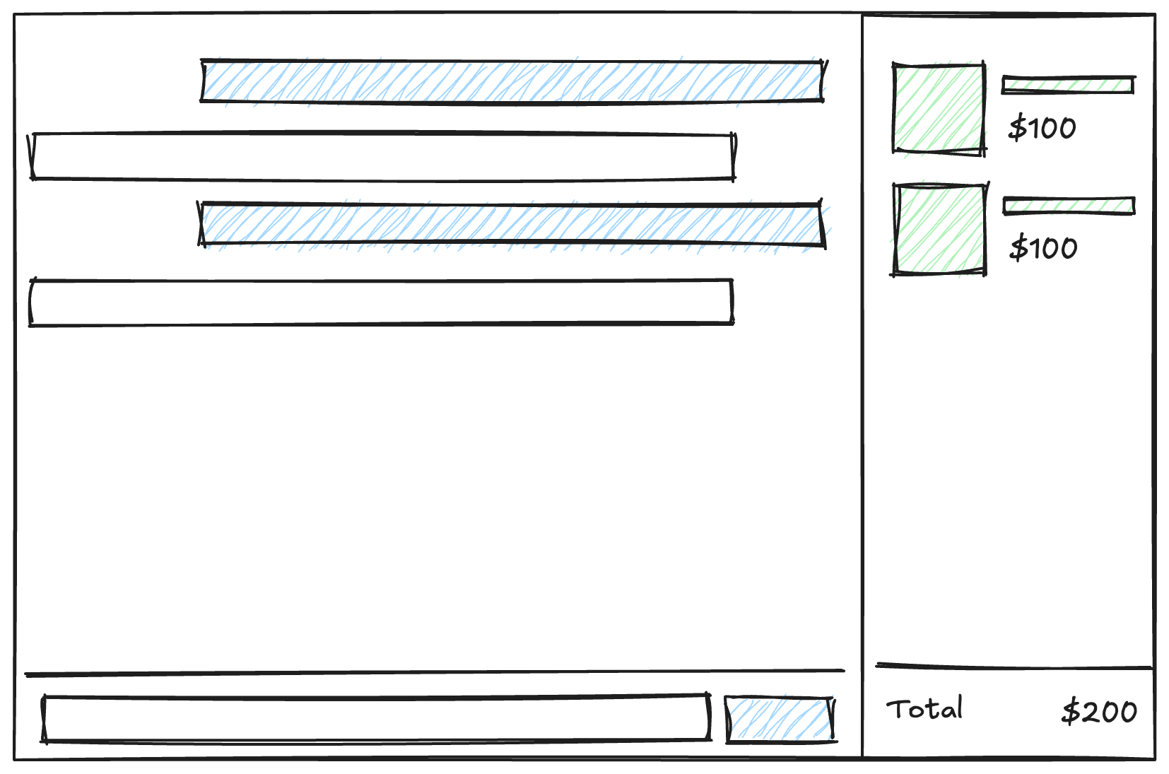
這一次的設計目標是提供一個對話介面,使用者可以透過對話介面跟 AI Agent 進行互動,並且由 Agent 幫我們操作右側的購物車介面。
同時需要保存對話紀錄,這部分會由後端處理,單就前端的部分我們需要的是這樣的畫面。
設計系統
設計系統是許多公司會用來規範視覺介面的機制,像是 Shopify 的 Polaris 或者 Adobe 的 Specturm 等等,其中 Design Token(設計符號)會描述各種視覺元素,像是顏色、圓角等等要素,後續的 UI 元件(Component)會以這些要素為基礎構成。
同樣的,在使用 Bootstrap、TailwindCSS 也是非常接近 Design Token 的概念,我們可以利用這樣的特性,撰寫一份設計指南給 AI 作爲參考,這可以很有效的控制我們生成的外觀會長怎樣。
如果不加以限制,每次產生的外觀都會有一些差異,在實際工作中可以搭配設計文件跟有視覺能力的模型,直接產生出 React、Vue 的 UI 元件。
這次作為練習,可以考慮到 Dribbble 這類設計師發佈作品的網站找喜歡的風格,參考以下提示(Prompt)範例,產生一份設計指引。
According this image, write a design guide document in markdown. The document should define design token in TailwindCSS.

The document should include follwing sections:

* Typograph
* Color
* Spacing
* Border基本上只需要這些內容,就可以產生類似下方的文件,因為 AI 會有一定的隨機性,可能需要多嘗試一兩次來調整內容,如果只是多了一些非必要資訊(如:React 範例)直接手動移除即可。
 1## Color
 2
 3Colors are defined as named variables.
 4
 5| Token Name       | Value     | Description                                |
 6| ---------------- | --------- | ------------------------------------------ |
 7| `primary`        | `#4F46E5` | Main brand color                           |
 8| `secondary`      | `#6B7280` | Secondary brand color                      |
 9| `background`     | `#F9FAFB` | Main application background                |
10| `card`           | `#FFFFFF` | Background color for cards or containers   |
11| `text-primary`   | `#1F2937` | Color for primary text                     |
12| `text-secondary` | `#6B7280` | Color for secondary or less important text |
13
14## Typography
15
16Define font families, sizes, weights, and line heights.
17
18| Token Name           | Value                                                                                                                                                                                                                                      | Description         |
19| -------------------- | ------------------------------------------------------------------------------------------------------------------------------------------------------------------------------------------------------------------------------------------ | ------------------- |
20| `font-family-sans`   | `['Inter', 'ui-sans-serif', 'system-ui', '-apple-system', 'BlinkMacSystemFont', 'Segoe UI', 'Roboto', 'Helvetica Neue', 'Arial', 'Noto Sans', 'sans-serif', 'Apple Color Emoji', 'Segoe UI Emoji', 'Segoe UI Symbol', 'Noto Color Emoji']` | Default font family |
21| `font-size-base`     | `1rem` (16px)                                                                                                                                                                                                                              | Base font size      |
22| `font-weight-medium` | `500`                                                                                                                                                                                                                                      | Medium font weight  |
23| `font-weight-bold`   | `700`                                                                                                                                                                                                                                      | Bold font weight    |
24| `line-height-normal` | `1.5`                                                                                                                                                                                                                                      | Normal line height  |
25
26## Spacing
27
28Define spacing values.
29
30| Token Name | Value           | Description    |
31| ---------- | --------------- | -------------- |
32| `space-0`  | `0`             | No space       |
33| `space-2`  | `0.5rem` (8px)  | 2 unit spacing |
34| `space-4`  | `1rem` (16px)   | 4 unit spacing |
35| `space-6`  | `1.5rem` (24px) | 6 unit spacing |
36| `space-8`  | `2rem` (32px)   | 8 unit spacing |
37
38## Borders
39
40Define border radii.
41
42| Token Name         | Value            | Description          |
43| ------------------ | ---------------- | -------------------- |
44| `border-radius-md` | `0.375rem` (6px) | Medium border radius |
45
46## Shadows
47
48Define shadow styles.
49
50| Token Name  | Value                                                                  | Description   |
51| ----------- | ---------------------------------------------------------------------- | ------------- |
52| `shadow-md` | `0 4px 6px -1px rgba(0, 0, 0, 0.1), 0 2px 4px -2px rgba(0, 0, 0, 0.1)` | Medium shadow |要注意的是,在使用其他人設計時,務必把參考的作品放在文件中。實際工作時,最好找設計師處理,避免在未授權的狀況下使用。
測試效果
完成設計指引後,可以先讓 AI 改寫 src/client.tsx 來簡單做測試,並且修改介面兩到三次,確定產生的設計文件有涵蓋我們所需要的介面,以及能正確參考到設計指引的參數。
在我們後續的實作中,可以得到類似下方的畫面。
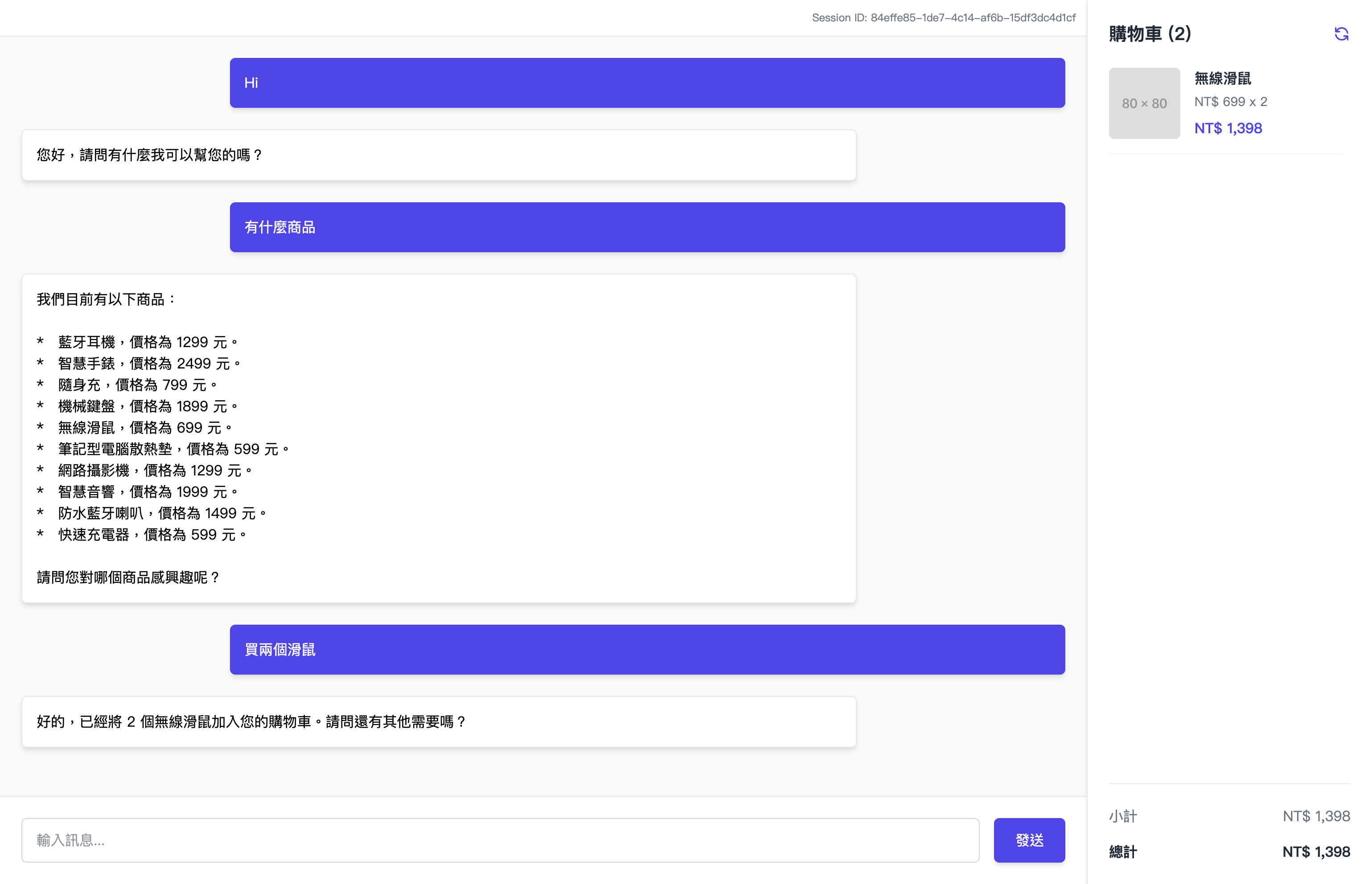
這樣我們在前端的準備就差不多,可以根據使用的 AI Agent 將設計文件保存成像是 DESIGN.md 或者 .github/prompts/design.prompt.md 等等路徑。
文中使用的是 Chatbox - Message Dashboard 這個作品的截圖所產生的 Design Token 來作為範例,但沒有特別微調到相似,僅用於產生一份可以穩定視覺輸出的樣板。